

It is large – much larger than I expected.

Let’s start with that red, which is the element which has attracted most of the negative attention. Is the King bathed in blood? Burning in hell? What was Jonathan Yeo, one of our foremost portraitists, thinking?
Someone, presumably the Drapers’ Company who commissioned the portrait, requested that the King wear the uniform of the Welsh Guards, of which he is Colonel-in Chief . And that is unmissably red. Acres of scarlet, broken only by occasional flashes of white, silver or gold. Plus his medals.
Now that gives a painter a problem. Because scarlet of that intensity is a strongly dominant colour.
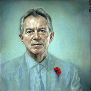
If you want to see why, check out Yeo’s controversial portrait of Tony Blair. Muted turquoises and teals make a graceful counterpoint to the flesh tones of the face – but the red of that poppy leaps out. For overseas readers, the Remembrance poppy is worn each year on Nov 11, Armistice Day, to remember the dead in war. By that poppy-red, Yeo has drawn the whole of Blair’s legacy into the the controversy of the Iraq war.
And he wasn’t the first to know what red does.Spots of red marked the feud between Turner and Constable. Constable famously drew attention to key elements of his work with dots and daubs of red. When you first see one of his paintings it’s a little game to find the red dot. In 1832’s Summer Exhibition, Turner’s muted seascape Helvoetsluys was hung next to Constable’s The Opening of Waterloo Bridge, which sparkled with scarlet flags, boats and uniforms. Turner felt upstaged, and famously then added one red buoy to his painting, which in turn stole everyone’s attention. “He has been here and fired a gun”, said the indignant Constable.
So red is a challenge for a painter. And the King is wearing lots of it.
What was Yeo going to do?
He could have taken the cool approach. Lose the brightness, grey it down, bring in some green. He could still have kept his characteristic focus on face and hands, with a looser body and background. That’s why he would have been chosen. That’s his style. Personally, I love his technical ability.
But that would have produced a fairly standard portrait – and the colour choice would have been rather flat.
Instead, Yeo took the much braver option, which was to embrace it. Put it everywhere.
He’s not the first to have done that. Two great painters famously facd the same dilemma, and made the same decision.
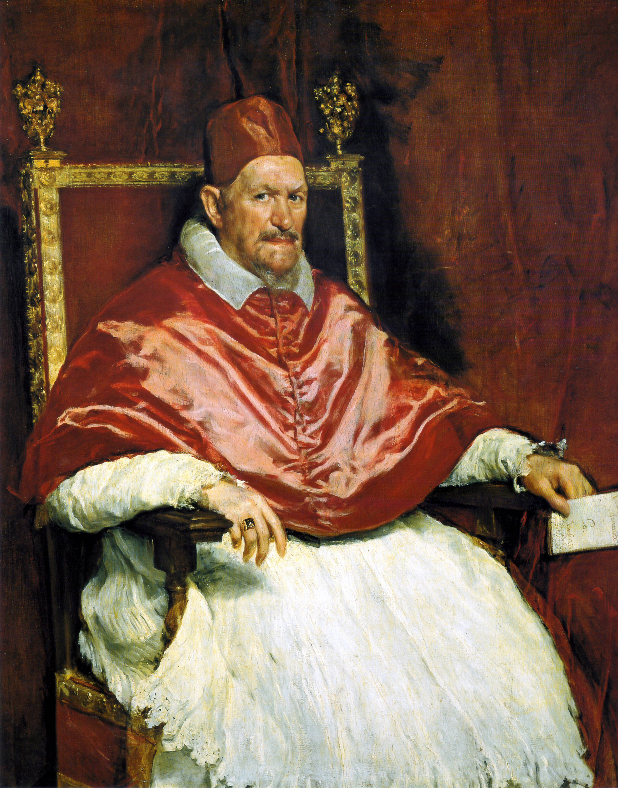
Look at Velazquez’s portrait of Pope Innocent X, resplendent in his scarlet silk. It’s one of the greatest portraits ever made. But mute the background, and the red would jump out, screaming for attention and drowning the man. Instead Velazquez echoed it, pulled it round the canvas, and so for all the virtuosity of the way the light catches the fabric, it’s the white – and the face – which draws the eye.
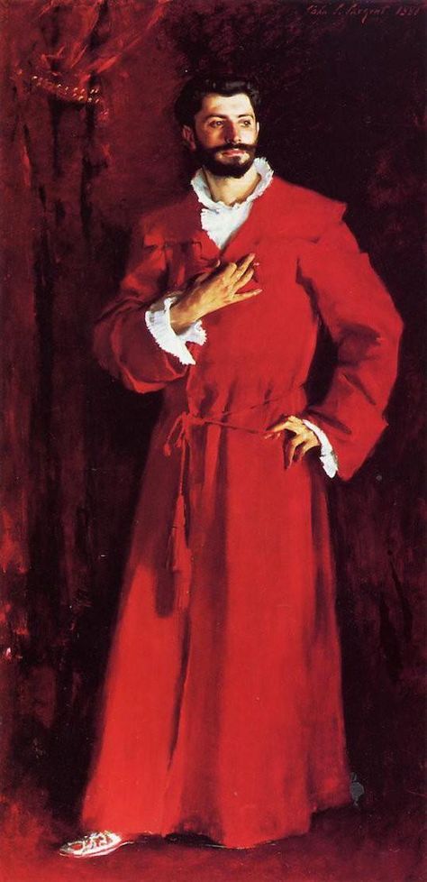
Even more obviously, look at the John Singer Sargent painting, Dr. Pozzi at Home. Again, he takes the red of the dressing gown, and runs it, echoes it, everywhere. With, once again, the focus drawn not just to his bravura use of the monochrome red, but the white, and the face.
Yeo stands in the great tradition of portraitists, and those two works will be intimately familiar to him. His is a knowing, and brilliant, decision.
You have to see the painting in person to see how good it is, which is always the way. At the risk of being simplistic, the King’s uniform is painted it shades of warmer scarlet, where the background is loosely scumbled in cooler crimson. The King stands forward. The medals, the buttons, the braid, the sword, are all there but they aren’t allowed to draw attention to themselves. The gold and silver has gone.
And so everything focuses on the face, and the hands.
For those of us who like portrait painting, we are living in a happy time. The riches of the tradition – Rembrandt, Hals, Velazquez, Sargent – with their wonderful warmth and looseness of brushwork, has suddenly come alive again in the last thirty years. The baton was taken up by Lucian Freud – although to my eye he is always a little cold. His people are colour-rich and human (the distortion of Bacon has been left behind), but Freud is distant, objective. Even his self portraits. And occasionally to the point of cruelty.
I’m not saying that Yeo is a Rembrandt or a Sargent, but he knowingly stands in that tradition. And compared to Freud, Yeo is kind.
The King has a twinkle in his eye as he looks at us. For all the pomp of monarchy, a smile runs over his lips – amused, self-deprecating, modest perhaps? In the great tradition, smiles were rare because they look forced, but when they work they draw us in.
Yeo isn’t afraid of controversy – Blair, and even more so the notorious porn-montages of President Bush show that. But here, he has painted a kindly portrait of a kindly man. It used to be said of the late Queen that she took the Queen very seriously, but she didn’t take herself seriously at all. Yeo has painted the King in that light.
And then there’s the butterfly near his right shoulder. A nod to the King’s environmental concerns, certainly. And maybe to the idea of his own emergence to new stages of life. Downstairs in the gallery is another, smaller painting of the then Prince Charles, painted from life at 25. It’s not a pointed contrast, but it’s there nonetheless.
So, how do we evaluate this as Christians? What is the gospel frame to put around it?
First, to say again, we need to see it properly, in the flesh. All the reproductions I have seen prepared me for something garish and, frankly, ugly. It is neither of those things. Sadly it’s behind a screen of security glass, which picks up reflections from the street outside and makes it hard to enjoy the brushwork up close. But, it really is worth the trek.
And at the risk of being a bit straight about it, this is about being truthful. I shouldn’t review a novel by watching a film. I shouldn’t denounce a new symphony by listening to a few clips in my AirPods. And I shouldn’t critique a large painting – a physical work of art – by scanning it on a small screen. Courtesy, honesty, bearing true witness, means that, if possible, we look before we say we hate it. As I’ve said, even though I’m a fan of Yeo, I was prepared for an assault. I shouldn’t have been.
This portrait falls firmly into the category of ‘Common Grace’ – God’s kindness to his fallen world that humans can enjoy creativity, make something of beauty, and celebrate one human’s perception of another human’s warmth. We need to have sufficient subtlety in our theology that we allow for the glorious talents of fallen human beings.
Then, we need to check our understanding of Modern Art. Christians of my generation grew up with a narrative of decline, in which the greatness of the Dutch Reformed worldview slipped, disintegrated, rebelled and devoured itself. Shattered by two world wars, Vietnam and the constant threat of nuclear devastation, humanity was marked by loathing and self-loathing. 1968 was the year of collapse.
It’s beyond my capacity, and your patience, to pick the bones out of that.
But from where we sit, art that is made today is not only troubling, transgressive and a celebration of sin. Much is, of course, but not all. Some of it, and here I’m admiring Hockney, is very beautiful indeed And the fact that it doesn’t celebrate saving grace, and is made by people who knowingly reject it, is not a reason to overlook the fact that it enjoys, albeit without realising it, common grace.
If you have eyes to see, there is good – even great – work being made today which is innovative without being decadent, and which is human and humane.
And, frankly, rather lovely.
The painting is currently on free display in the Philip Mould gallery, on Pall Mall, London.
And, yes I know the reference in the title dates me.


3 comments on “King Crimson – my thoughts on that portrait”